
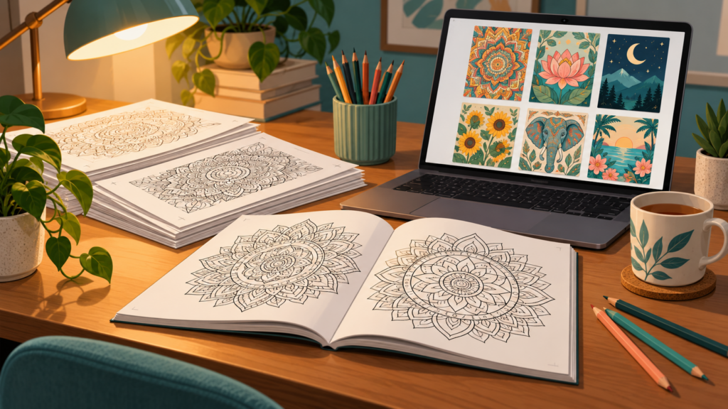
Most coloring books on Amazon KDP that sit unsold share the same fixable quality problems. A walkthrough from the Self Publishing Empire channel, built on live Amazon searches, Canva pages, and “look inside” previews, points to five recurring mistakes: pages assembled from unmodified Canva elements that can get a book blocked and an account terminated, covers that lose to the organic best sellers beside them, interiors with gray shading and low-resolution blurry images, near-copies of established publishers like Coco Wyo, and listings that never show buyers a single interior page. The remedy is the same in every case: a quality-first checklist applied to a small catalog. Roughly ten strong books will outsell hundreds of weak ones.
Stop Publishing Unmodified Canva Elements
The first mistake is also the most dangerous one. Dragging elements from Canva’s freely available library onto a page and publishing them unchanged risks the book being blocked and, worse, the account terminated. According to the presenter, Amazon KDP wants bespoke, individualized designs, not duplicated content that thousands of other publishers can assemble from the same library.
Run a simple test before upload. Place your finished page next to the raw Canva elements you started from. If a reviewer could not tell which parts you made, the page is not bespoke. Combine elements into new compositions, redraw the linework, add your own motifs, or build custom line art from scratch. The finished page should exist nowhere else on Amazon.
Remember what failure costs here. A flagged page does not take down one book; account termination ends the entire publishing business. That makes this the first box on the checklist and the one never to skip.
Benchmark Your Cover Against Organic Best Sellers
Buyers meet the cover first, inside search results where it appears as a small image beside everything else competing for the same keyword. In the channel’s comparison for the search “dog coloring book,” weak sponsored listings sit next to strong organic best sellers, and the sponsored ones look weak because their placement is paid rather than earned.
That distinction tells you which covers to measure against. Sponsored books appear in results regardless of quality. Organic best sellers earned their positions through sales, so their covers are the actual competition.
- Search your exact target keyword on Amazon.
- Skip the sponsored rows and screenshot the top organic results.
- Drop your cover into that grid and judge it as a small thumbnail, the way a scanning buyer would.
- Adjust typography, subject clarity, and color contrast until your cover belongs in that row.
Keep the Interior Black, White, and Sharp at Print Resolution
Interior problems surface after purchase, in reviews. Three keep coming up: gray shading that prints as muddy patches no one wants to color over, low resolution that turns AI-generated images which look fine on screen into blurry print, and inconsistent style when pages from different sources end up in one book.
- Keep pages black and white. Pure line work, no gray shading.
- Upscale before upload. The presenter names upscaling sites such as bigjpg, or vectorizing the images so lines stay crisp at any print size.
- Hold one style across the whole book: consistent line weight, consistent detail, one visual language from the first page to the last.
Reviews that mention blurriness stall sales, because a coloring book is judged almost entirely on the quality of its pages. Fixing resolution before publication is far cheaper than answering complaints afterward.
Differentiate Instead of Copying Coco Wyo
When a publisher like Coco Wyo sells well, the temptation is to imitate the book. The warning is blunt: their sales come from a brand following, and copying the book does not copy the following. Buyers who want Coco Wyo buy Coco Wyo.
The alternative is to offer something better or different. The cited example is a “dogs in cars mandala” book ranking around 5,000 in Books. The concept is specific enough that no major publisher owns it, unusual enough to stand out in search results, and still unmistakably a coloring book. That is the pattern to aim for: a niche nobody dominates, executed well.
Page count is part of differentiation. A 35-page book competing against titles with 50 to 150 pages starts with a visible disadvantage on the listing. Match the standard page counts in your niche, or make a shorter book clearly better on quality.
Show Interior Pages With A+ Content
The “from the publisher” section below a listing is A+ content, and many coloring book publishers leave it empty. That wastes the one spot where you can show buyers exactly what they are paying for: the pages themselves. The walkthrough contrasts thin listings with a well-executed Coco Wyo listing that uses this space well.
- Show representative interior pages at a size where the line quality is visible.
- Show the range of the book: subjects, styles, and page count.
- Answer the buyer’s real question, which is whether the pages are worth coloring.
Ten Strong Books Beat Hundreds of Weak Ones
The closing message of the checklist is quality over quantity: prioritize roughly 10 high-quality books over hundreds of low-quality ones. The reasoning holds up in practice. Every weak book still costs design time, still carries review risk, and still represents your brand when a buyer lands on it. A catalog of ten strong books can be checked page by page against the standards above. A catalog of hundreds cannot, and the weak titles drag down everything around them.
Before your next coloring book goes live, run the full check:
- Every page is bespoke, not an unmodified Canva element.
- The cover belongs next to the organic best sellers for its keyword.
- The interior is black and white, upscaled to print resolution, and stylistically consistent throughout.
- The concept is differentiated, not a copy of a big publisher’s book.
- A+ content shows interior pages to buyers.
A small catalog that passes all five checks has a far better chance of earning the reviews, rankings, and repeat buyers that coloring books need to keep selling.